Help Center
Role: UX Designer
Duration: 3 Months
Platform: Desktop and Tablet
Team: 2 UX Designers, 1 Product Manager, 1 Tech Lead, 2 Developers
OVERVIEW
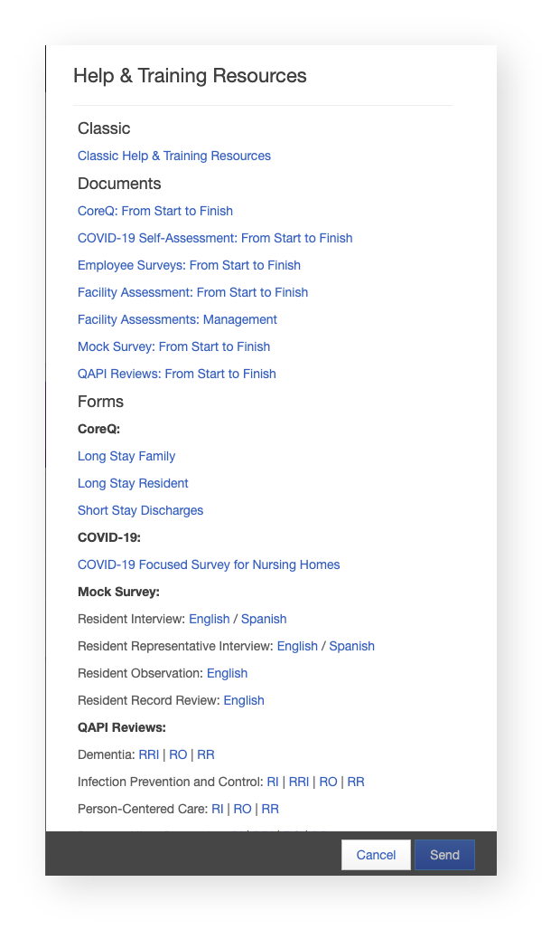
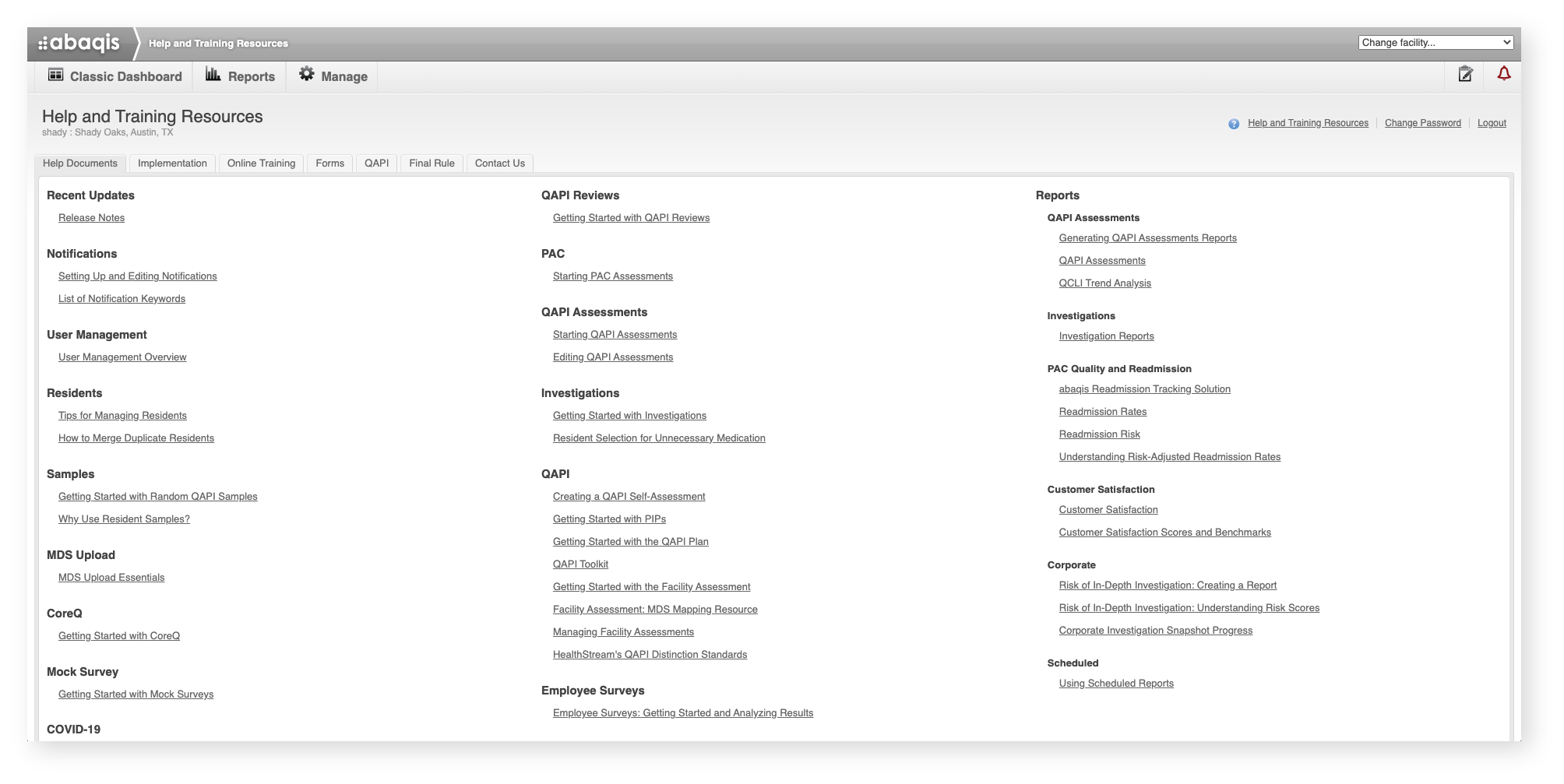
At the time of this project, our help documents were located in two different places. The majority lived in our legacy system, and our newer help documents, related to our newer features, lived in our updated system. The main goal of this project was to create one place for all help documents to live, and the desired place was our newer system because that was the future of our product. Eventually, all features will be migrated over to our newer system.
Goals:
Create a single home for all abaqis help documents
Update organization of old and new documents in a more feature-forward way
Refresh UI from older legacy system to newer, more intuitive style
DISCOVERY
Card Sorting
Our legacy system, where most of our help documents lived, was designed when our product only had products that mirrored the surveying process at the time. Though, in 2018, the entire process changed, and that is when we began to develop more products that were focused on quality rather than only compliance. Unfortunately, our help system’s organization was still organized to reflect what abaqis was rather than what it is now. To learn how our organization has evolved, we began our discovery with open card sorting exercises.
It is important to note that this project was being conducted in the summer of 2020, so our access to users in the medical field during the pandemic was unfortunately limited. We decided to work with our software trainers and customer support team because, at the time, they had more interaction with users than we did, and they actually utilized the help documents on a daily basis. Depending on their phases of training, they would collect appropriate help documents to send to customers which offered a valuable insight into when customers were accessing certain documents at certain points in their workflow.
What we discovered during these exercises was that many categorized the help documents in a feature-forward way. Instead of having all documents related to different features/tools, as they were currently organized, they put them in their own categories. They also organized help documents by role. For example, documents that were only relevant in the management of facilities, users, and residents were placed in a “Managing abaqis” category. That way, a manager, who has more responsibilities and need of help documents have an easier way of accessing them directly.
In almost every card sorting exercise, we noticed that there were several documents that they did not remember. Many even created categories of “trash.” This then led us to conduct a thorough content audit to weed out documents that were out of date, irrelevant, or perhaps not even titled correctly with the content given.
Content Audit
We audited our 77 help documents, and that led us to trash 4 documents and discover several that were titled in misleading ways. In our spreadsheet, we began to update names with more clearer, action-forward titles. For example, instead of “User Management Overview” and “Tips for Managing Residents”, we renamed them "Adding and Editing Users” and "Adding and Editing Residents.”
After completing our audit, we began to organize them using the patterns we learned from our internal team members. Then, we presented the new names and the new organization to them and other stakeholders. We received the approval and go ahead to begin designing the new help center.
DESIGNS
Wireframes
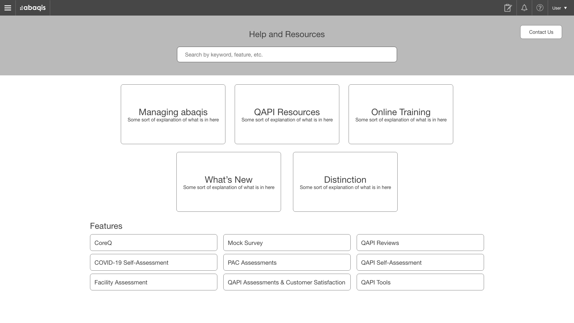
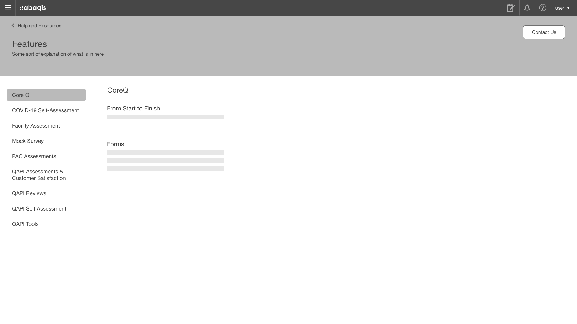
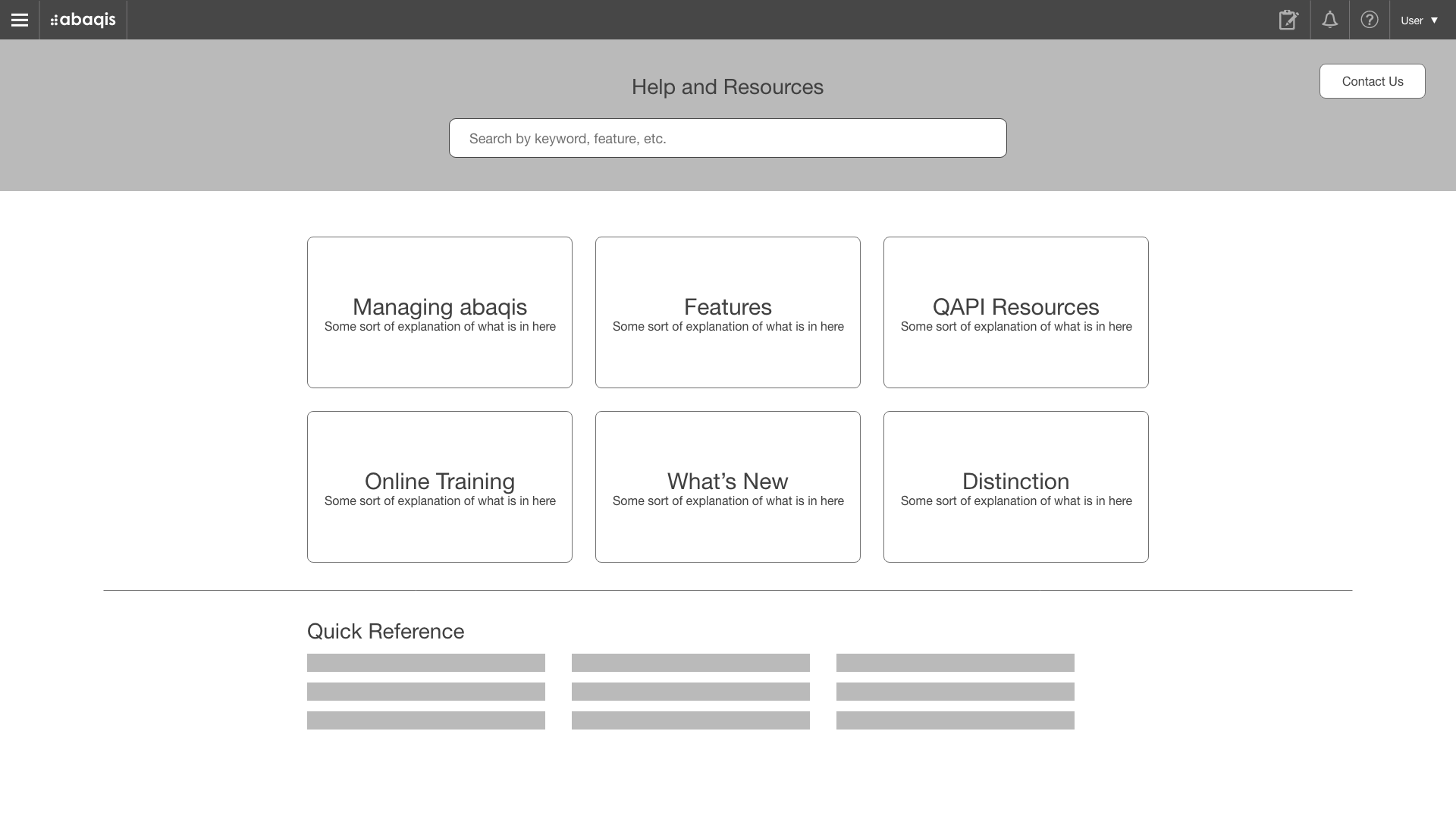
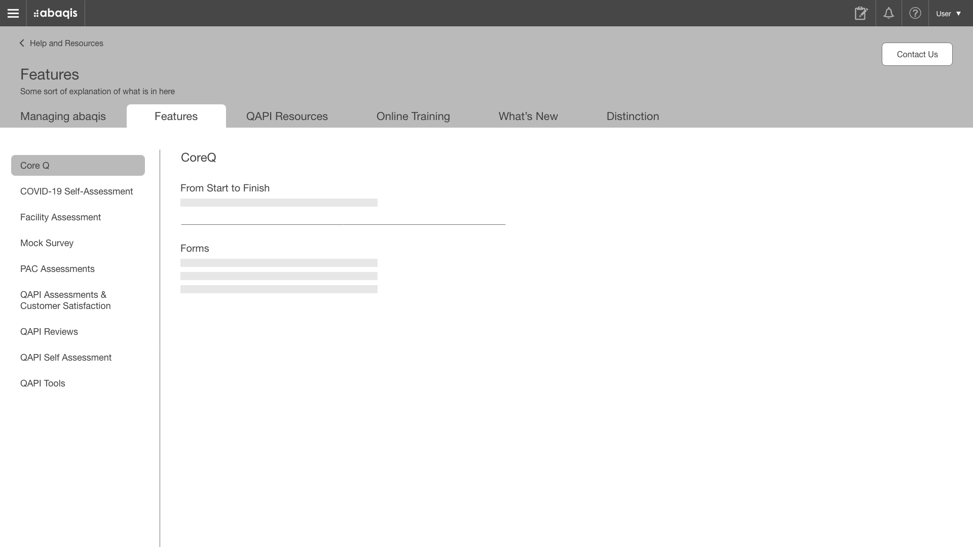
We had two different layouts of the main page, and the feedback was that “features” should be more prominent. Instead of putting them in their own main category, or even below the main categories, they should be pulled out and put first because those are the documents that users need the most.
High-Fidelity Mock-Ups
With the shift of more focus to the features, we presented several mock-ups incorporating our feature colors, descriptive icons, and first drafts of category descriptions. Overall, feedback was again very positive, but we did receive concerns from the development team regarding the search functionality. Given time and resource constraints, we needed to remove that functionality for now.
Playing with style
Final Mock-Ups
These were the final mock-ups given to the development team. We played with the header’s graphic with some of HealthSteam’s brand assets to create more texture.
TESTING AND FEEDBACK
After we deployed to our testing server, we asked the trainers, sales team, and customer support team to explore the new help system and provide any feedback on where they felt lost or couldn’t find certain help documents. At that point, we received a few pieces of feedback that led to us to bring back a few of the deleted documents (after they decided that they were still relevant after all) and rename some. As the feedback was a simple addition of links and text changes, it was no problem for developers to make those changes before official deployment.


